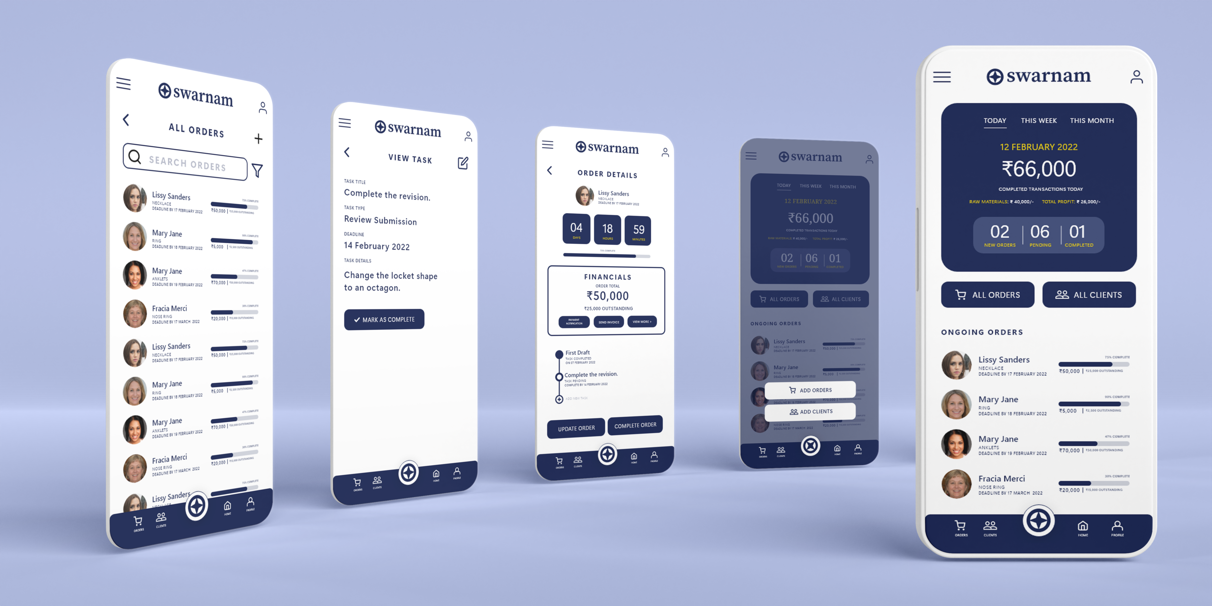
Swarnam is an app for jewellery designers to manage their clients and orders. The app lets the designer add clients, add orders, notify clients and also ask for feedback. This was the first assignment of Google UX Design Professional Certification.
The Problem
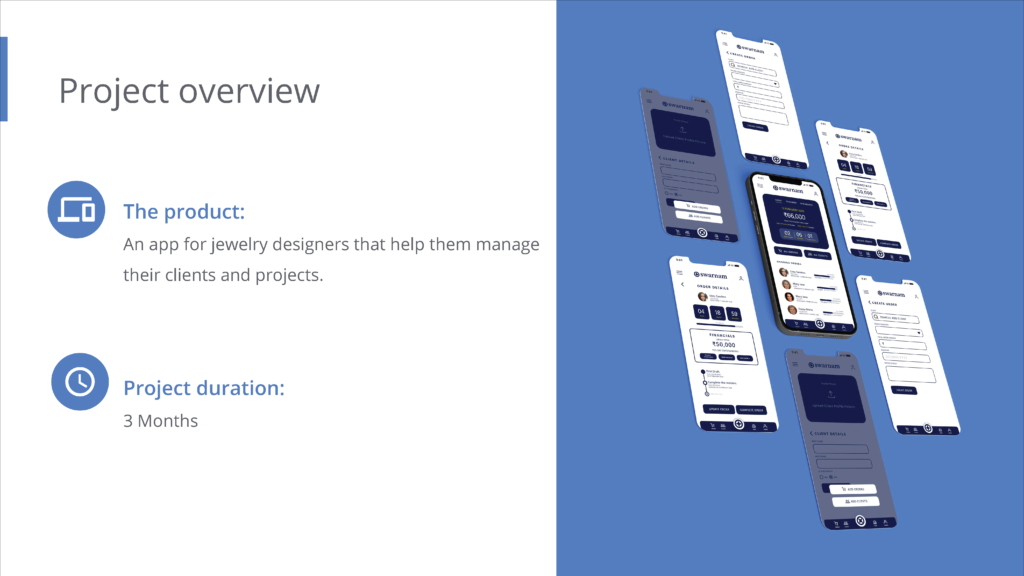
The task given was to design a client management application for jewellery designers. The designers find it difficult to manage clients and orders and to provide updates regarding orders. The goal of the project was to create a mobile application that help jewellery designers manage their clients and to provide their clients with every updates regarding each order.
In this project, I was expected to use the design thinking framework to conduct user research, empathise with potential users and design the application through wireframing, lo-fi prototyping, usability testing and final high-fidelity prototype.
User Research
The user research was conducted assuming the designers to be of ages 25-67. The category of the app users was assumed to range from individuals who are hobbyists to professionals and small businesses. It was assumed that the clients of the designers would be of the ages 16-60 and a majority of the potential users are assumed to be female.
The research method used was interviews. The inputs from the interviews were analysed using affinity mapping. The user research gave insight to the pain points of the users.
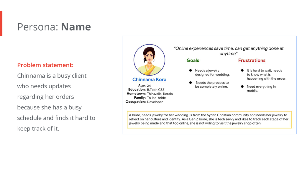
Personas
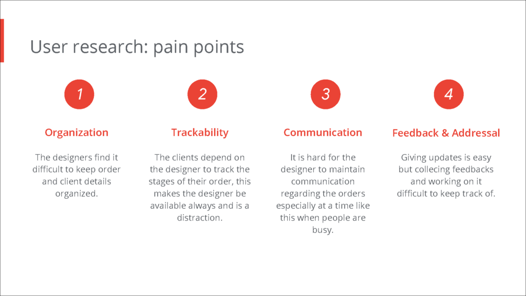
Personas of potential users were created to understand them, their struggles and their needs.
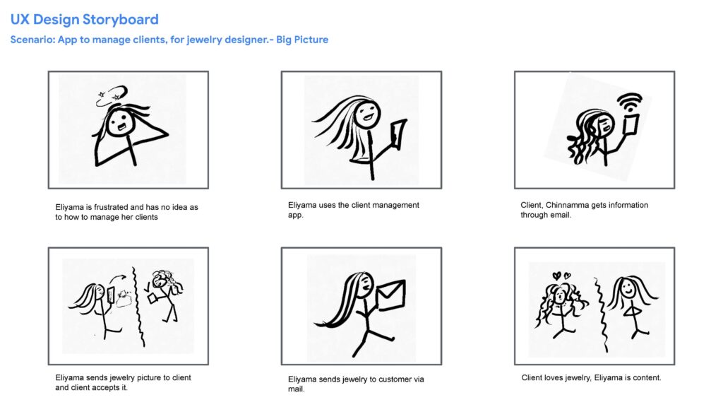
Story Boarding
A storyboard was created to visually represent a scenario where the jewellery designer struggles to manage her clients and then how solving the problem would look like. The personas were brought to life using the storyboard method.
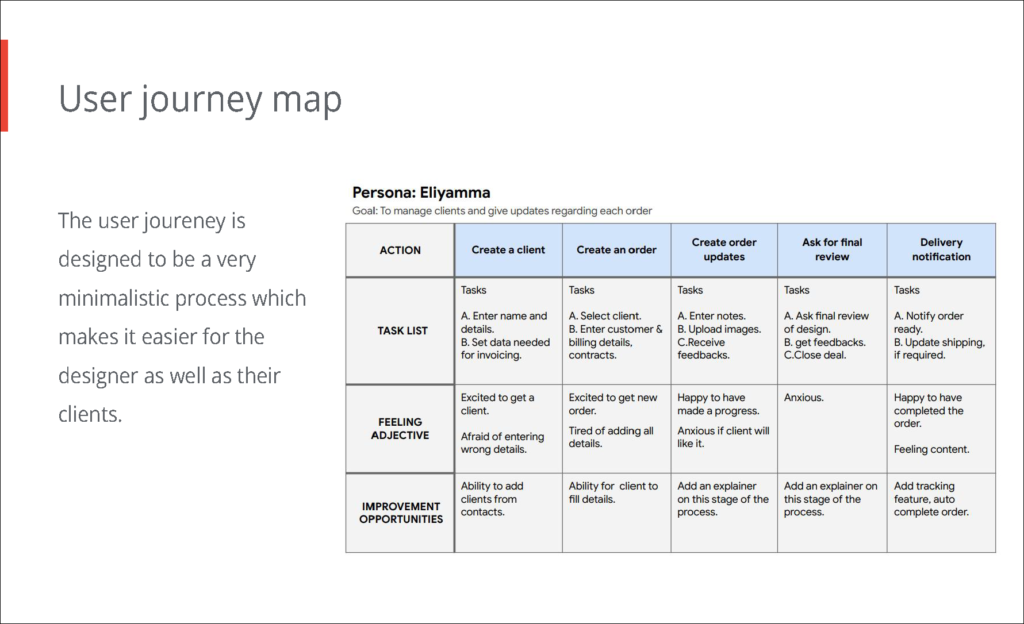
A basic user journey map was created to define each step the designer would take to accomplish the goals laid out.
Design and Implementation
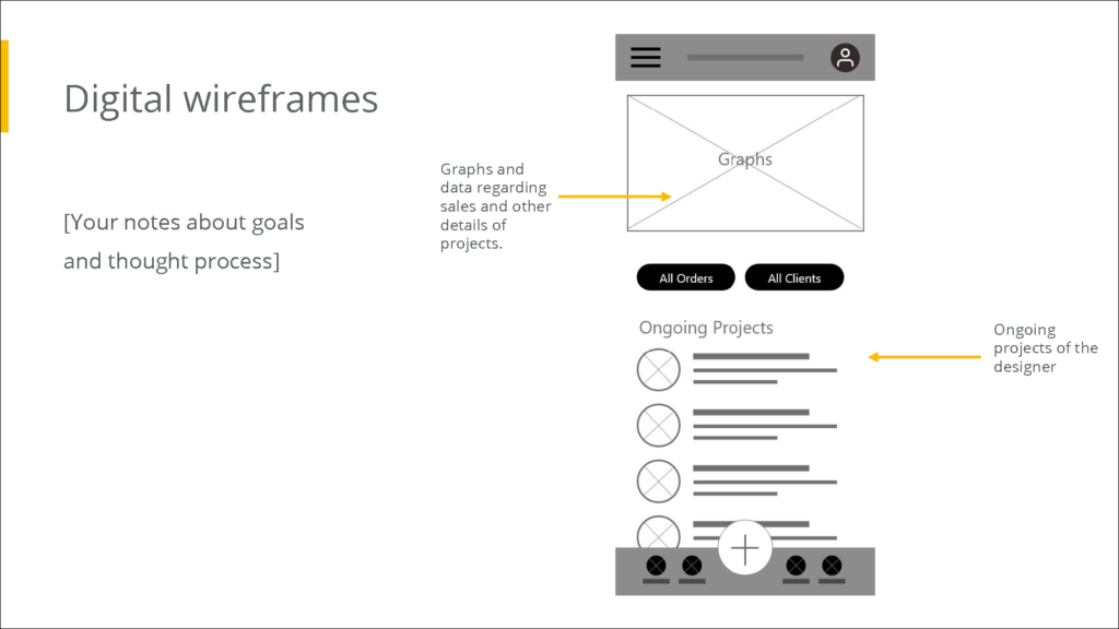
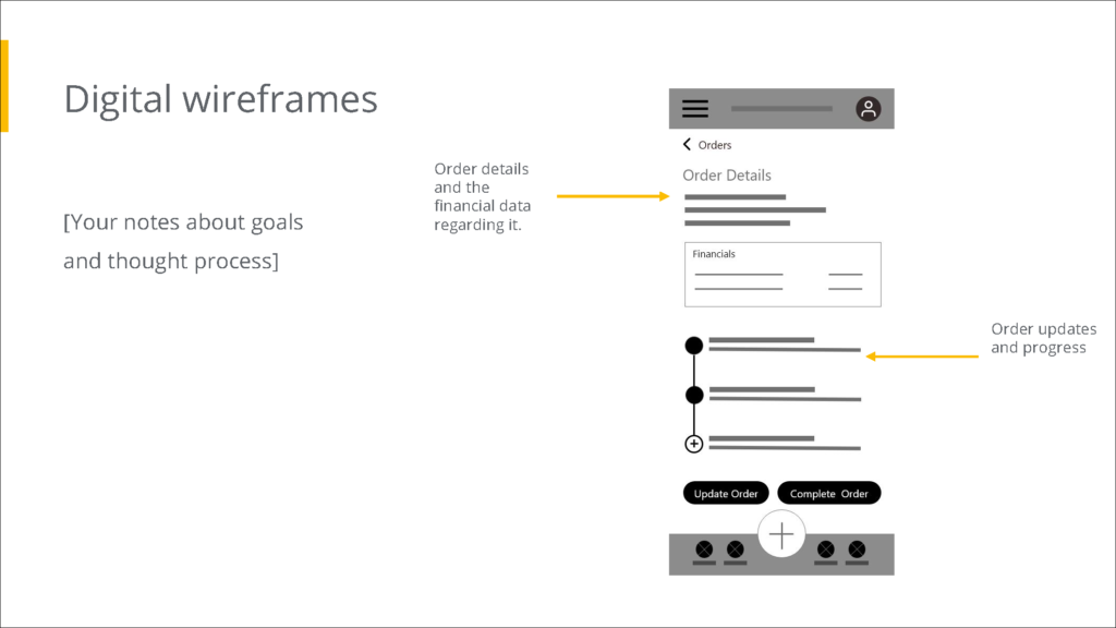
The design was implemented by initially sketching out the screens that could be part of the final product. These sketches were drawn keeping the needs of the personas and others in the user journey map.
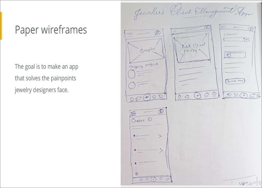
These sketches were then converted into digital wireframes and interactions were added to the digital wireframes to create a low-fidelity prototype. Few of the digital wireframes are explained in the following figures.
Usability Study
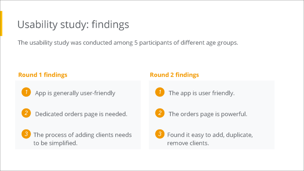
The low-fidelity prototype was tested for usability. The usability test was conducted on 5 participants and the test was conducted in two rounds. The findings of the test was analysed and the following observations were taken.
Revision
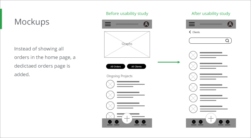
The findings from the testing phase were used to revise the prototype to fit the needs of the users better.
Low Fidelity Prototype
The interactive lo-fi prototype is embedded below. This is the final lo-fi design.
High Fidelity Prototype
Elements like colours, media and style were added to the final lo-fi prototype to create a high-fidelity prototype that can act like the final application post-development. The interactive hi-fi design is embedded below.
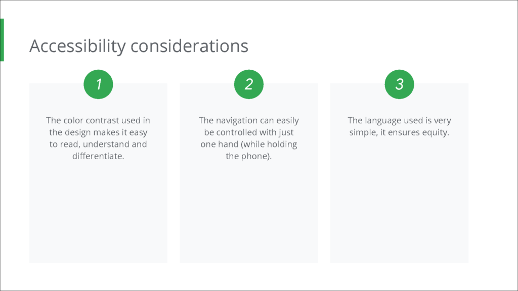
Accessibility considerations were taken to provide the best experience possible to a majority of the end users.
Learnings
The application designed is a simple solution to the given problem. The design focused on minimising the efforts clients need to take like signing up and more. The design aims to give an effortless experience to users.
Implementing this project, I learned the concepts of equity, accessibility, and many elements of user research and analysed these elements to identify gaps and to come up with design solutions to fill those gaps.


