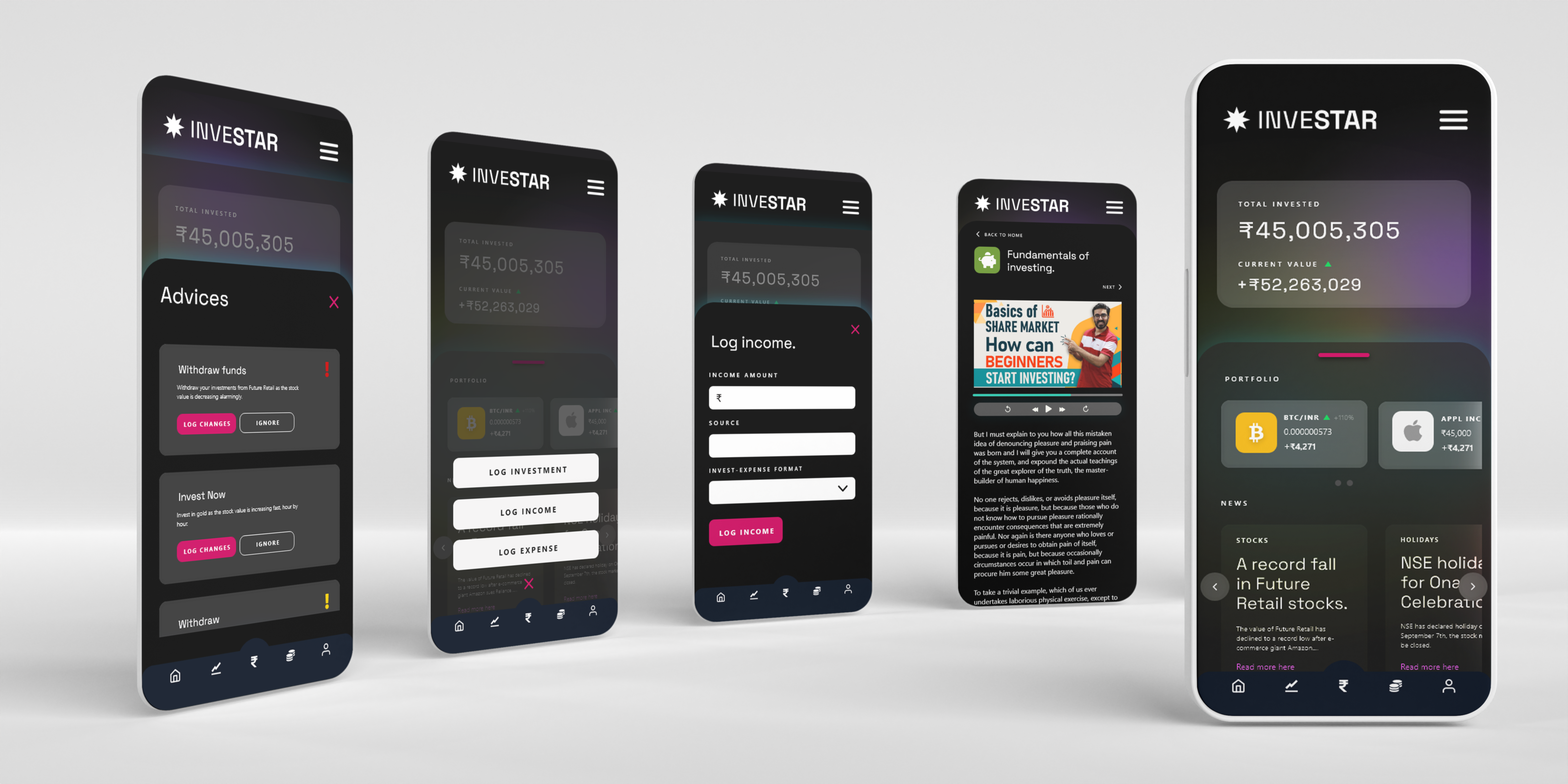
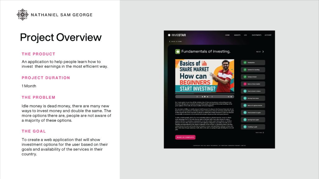
Investar is a simple app that helps users to learn about investing, to know investment options to keep track of their income, investments and expenditure. The app also gives financial advises to the user with the given data. This was the third assignment of the Google UX Design Professional Certification.
Please see the project details here.
User research
A user research conducted to understand the potential users of the application that is focused on educating its users about managing finances and investing.
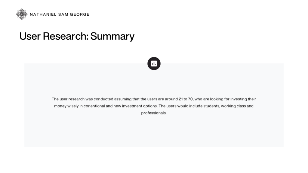
Based on the research, the painpoints were noted.
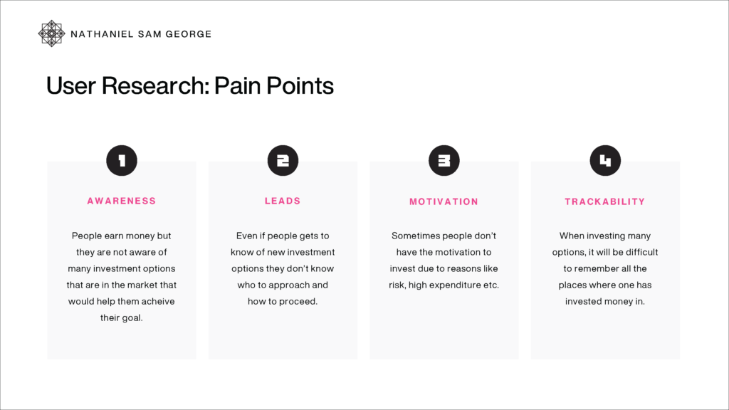
The painpoints and goals of the samples of the research were combined to form two personas representing two kinds of users, one is Zayit who is young and and want to start to make investing a habit and wants to be financially literate so that he’s safe for future. Then there is Miriam who is in her mid 40s who is struggling to manage time and resources.
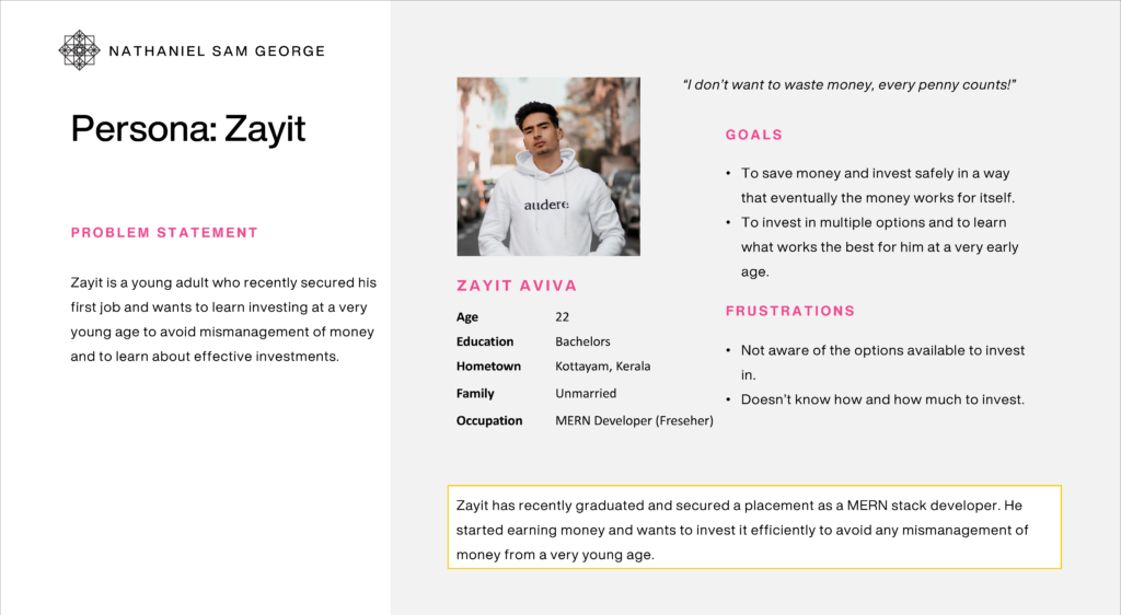
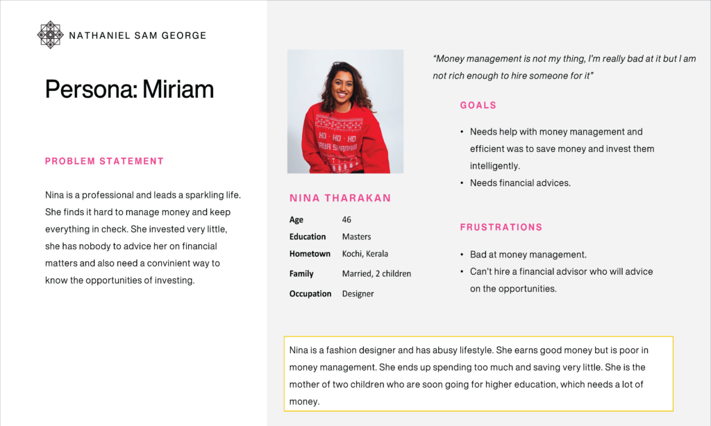
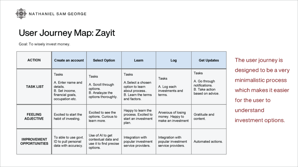
A user journey map was created based on the needs understood.
Design
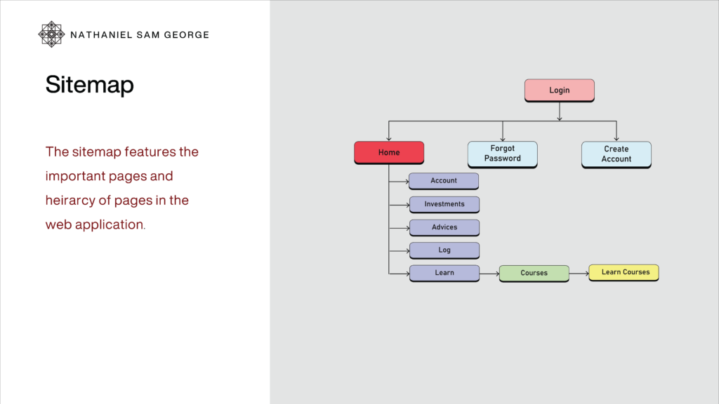
A sitemap was created to list out screens and to arrange them in heirarchy.
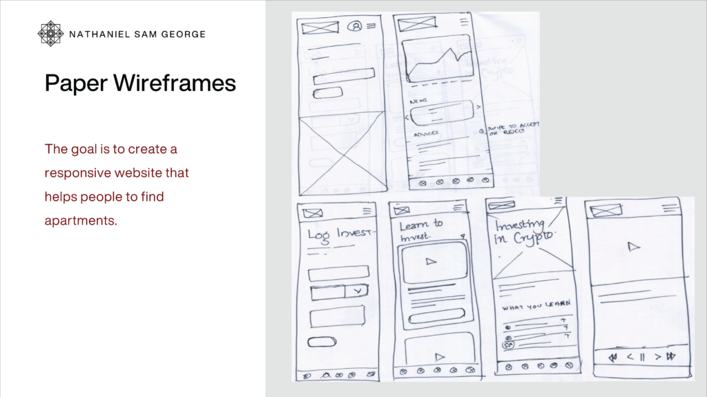
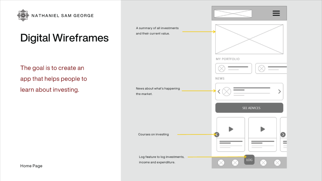
Sketches and wireframes were created to visualize the interfaces for the application and the signifiers.
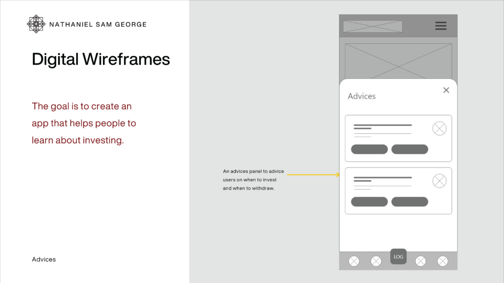
usability study
The digital wireframes were made into a low-fidelity prototype by adding interaction to the screens and elements. A usability test was carried out on the lo-fi prototype and the findings were recorded, amendments were made and the final lo-fi prototype was used as a reference to create the final high fidelity prototype.
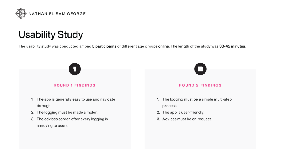
updated mockup
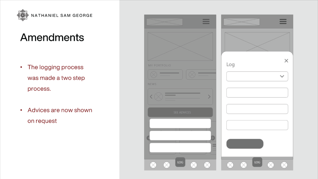
Low fidelity prototype
High fidelity prototype
The high fidelity prototype was created in Adobe XD. The interactive prototype is embedded below.
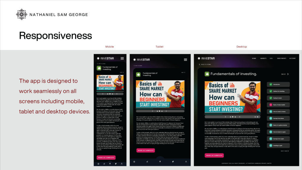
Responsive design was considered for the application so that it can be used on all popular screen sizes without issues.
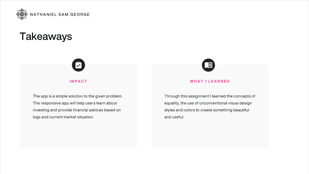
Learnings
